PwC – Designing PwC’s Divestment Analysis Platform to Streamline Strategic Business Breakups
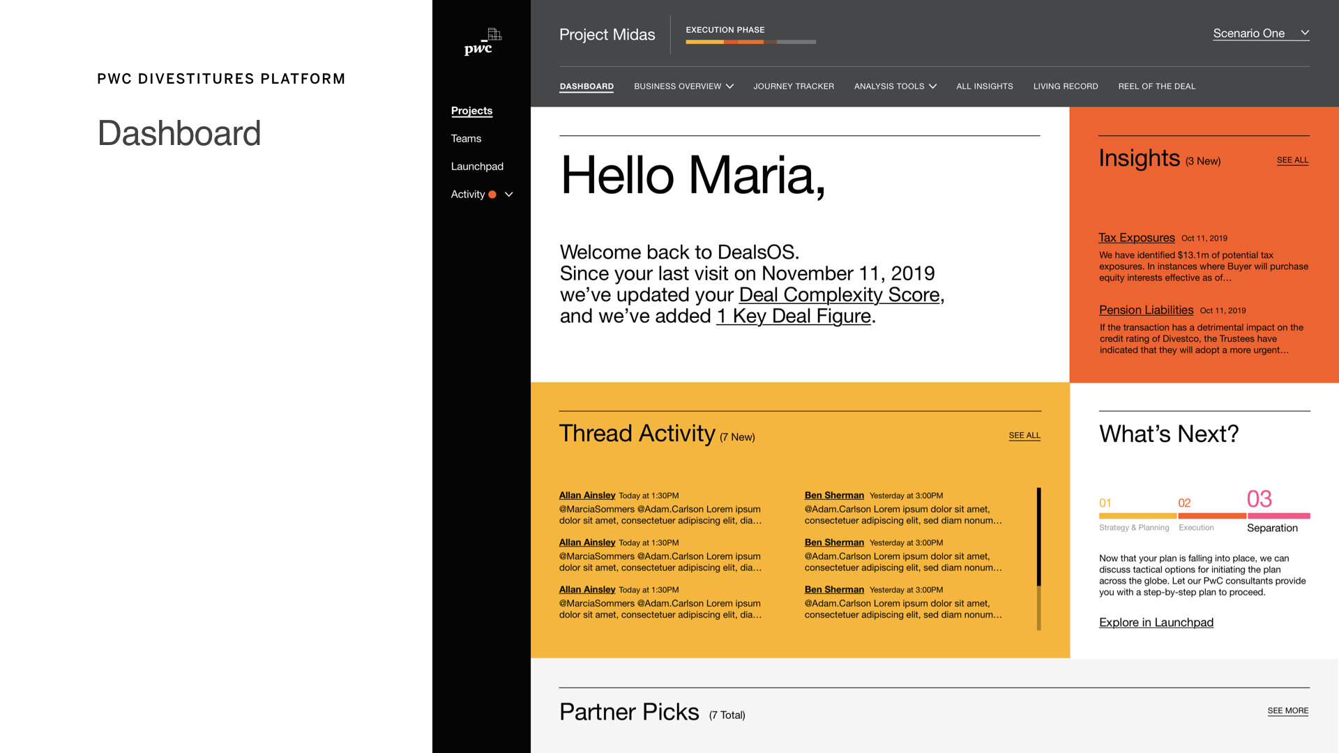
As Lead Interaction Designer, I designed PwC’s internal platform for analyzing business divestments. The product helps consultants and clients assess asset value, isolate business units, and identify sell-off opportunities. Over an 8-week sprint, my team and I designed 20+ features, built a dynamic design system, and delivered a foundation now used across PwC’s global operations.
Role
Lead Interaction Designer
Timeline
8 weeks (2023)
Platform
Internal Corporate Web Application
Team
PwC Leadership, frog Product Team, Creative Director, Visual & Interaction Designers
Before (Challenge) → After (Solution)
PwC consultants lacked a centralized tool for visualizing and analyzing business units for divestment. → Designed an end-to-end platform supporting consultants and clients in analyzing and valuing carve-out units.
No structure in place for staging complex data inputs and user collaboration. → Delivered a modular system with onboarding, data entry, team-building, and interactive commenting.
Stakeholders needed to socialize the future vision while building toward long-term change. → Built a parallel Tableau-based visualization tool to begin user training and change management efforts.
How We Got There
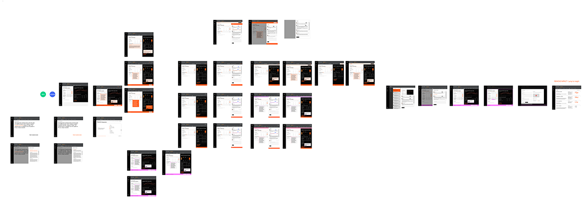
Led interaction design for a 20-feature roadmap, broken into agile 2-week sprints with 5–7 features each.
Collaborated with PwC’s global consulting and design leadership in daily working sessions and weekly stakeholder reviews.
Defined the navigation model and core design system to support data complexity and modular UX patterns.
Created wireframes and mid-fidelity flows, then paired with visual designers and junior IxDs to evolve into full designs.
Delivered high-utility components for:
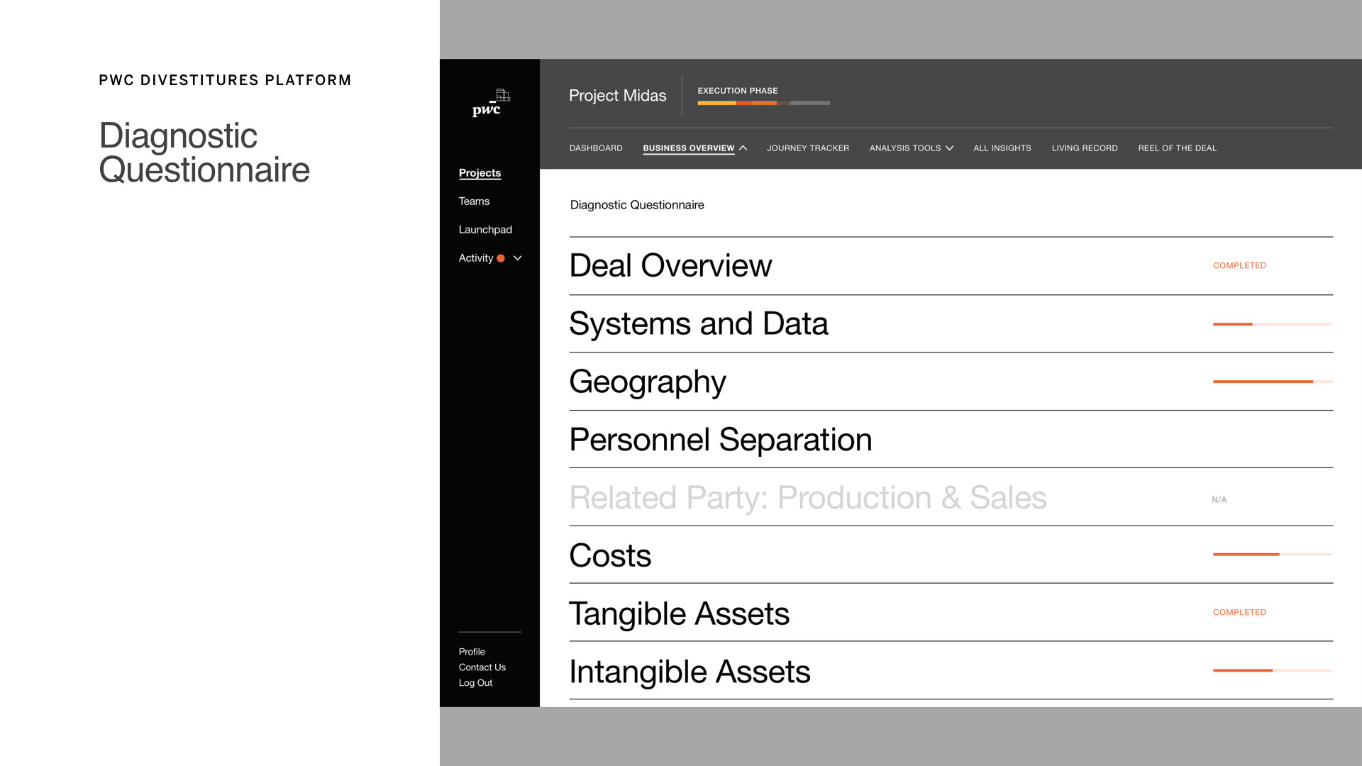
Client onboarding questionnaires
Data ingestion and manipulation
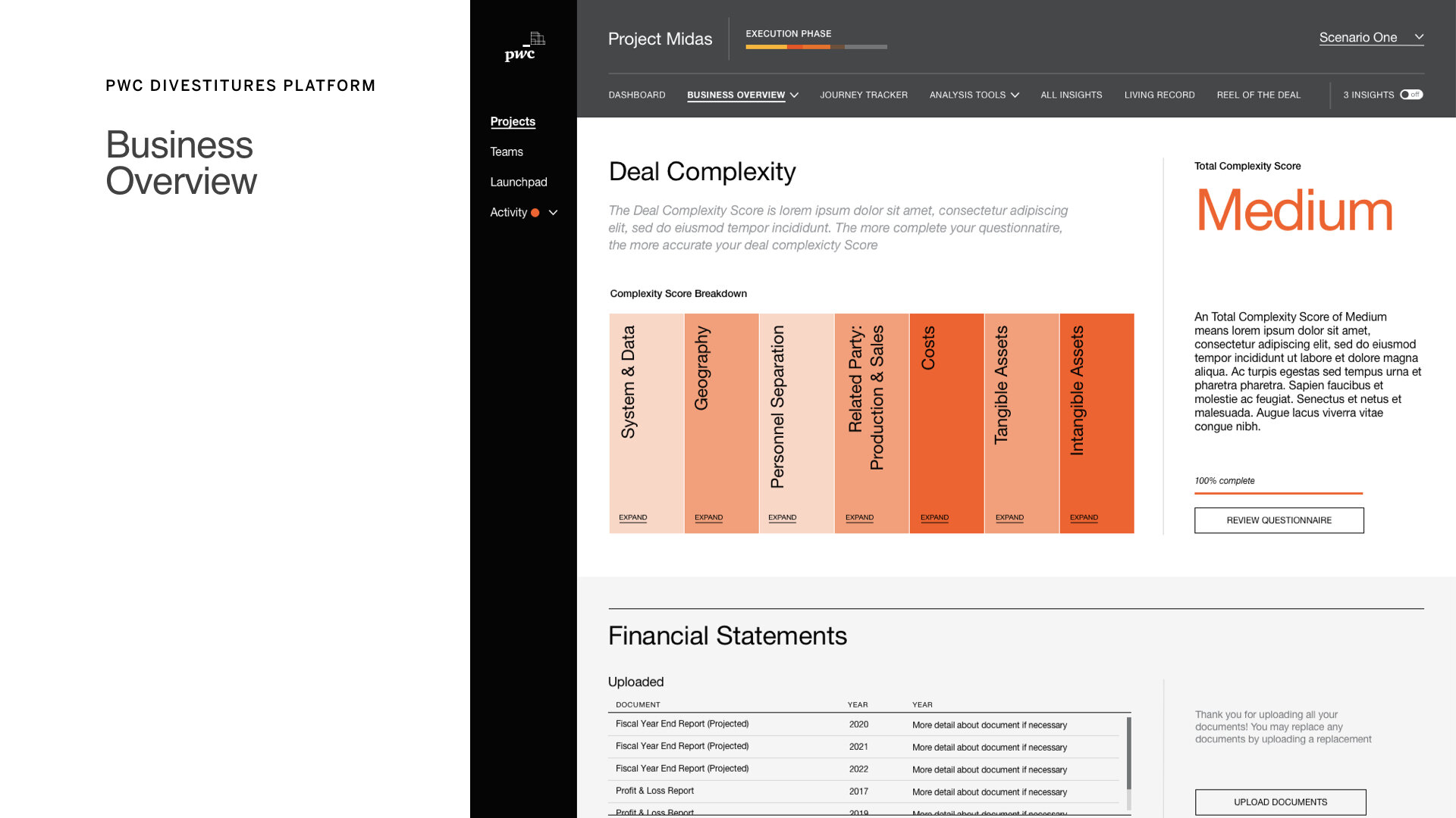
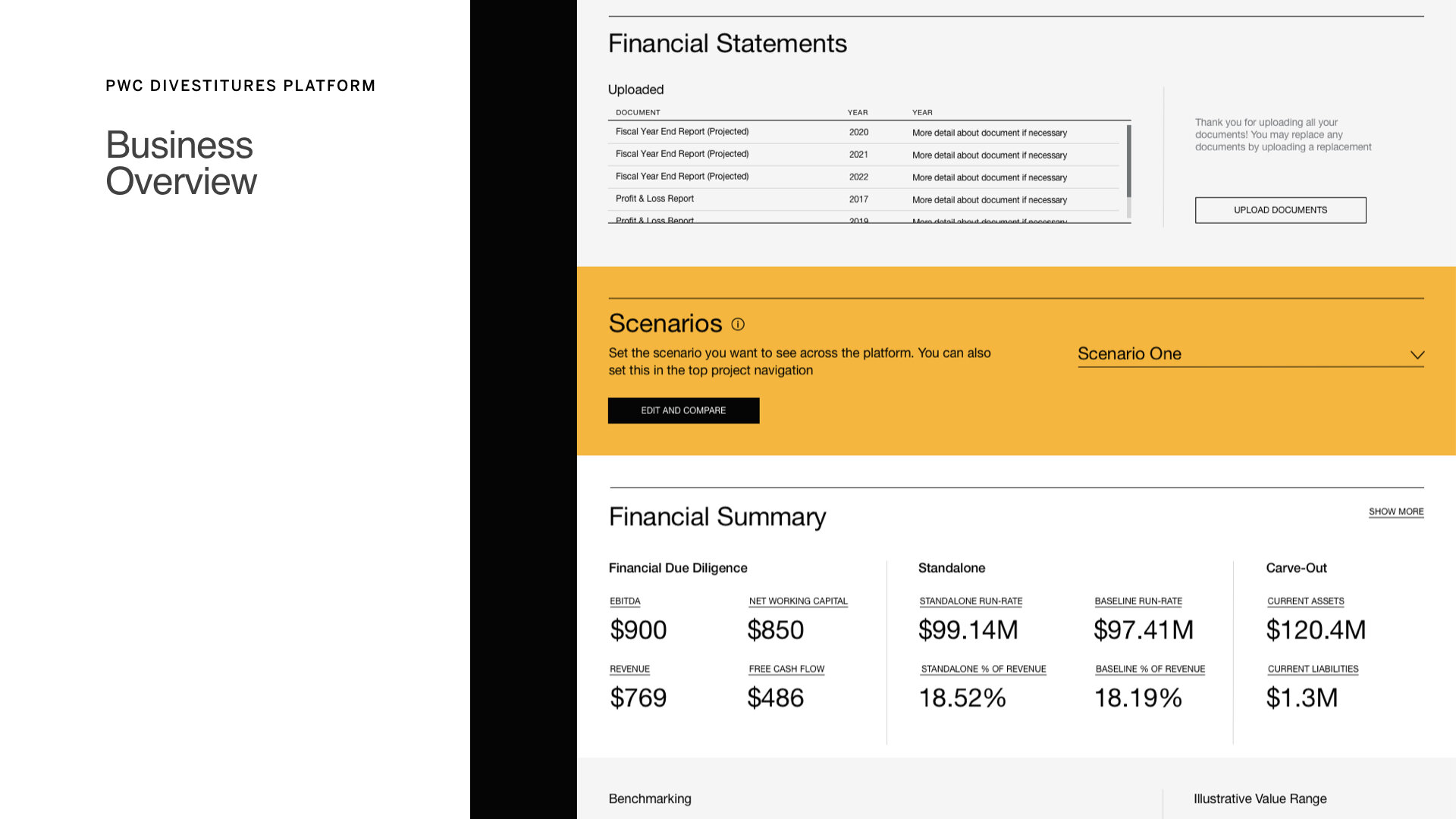
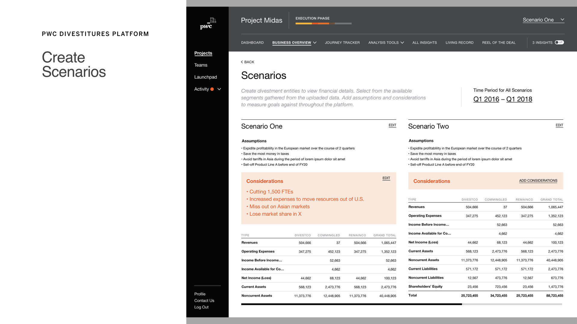
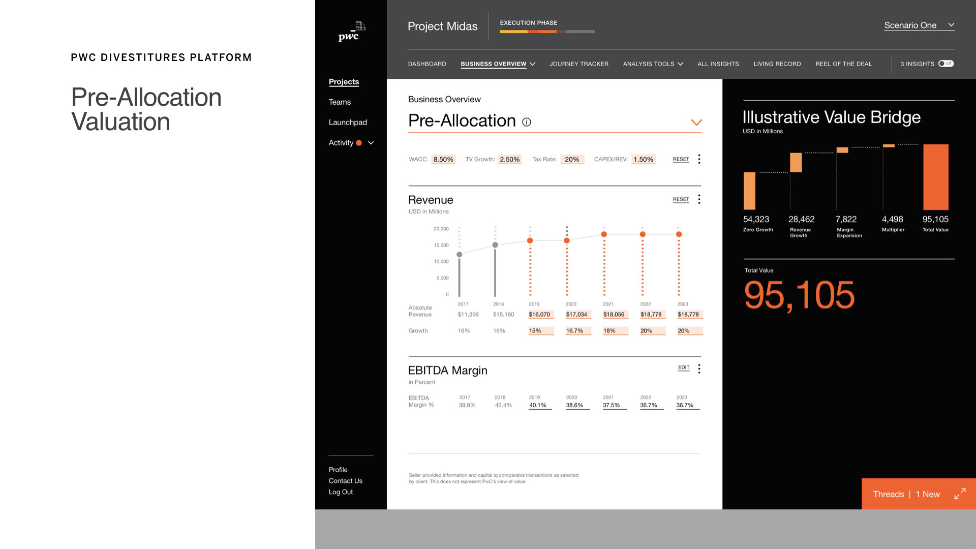
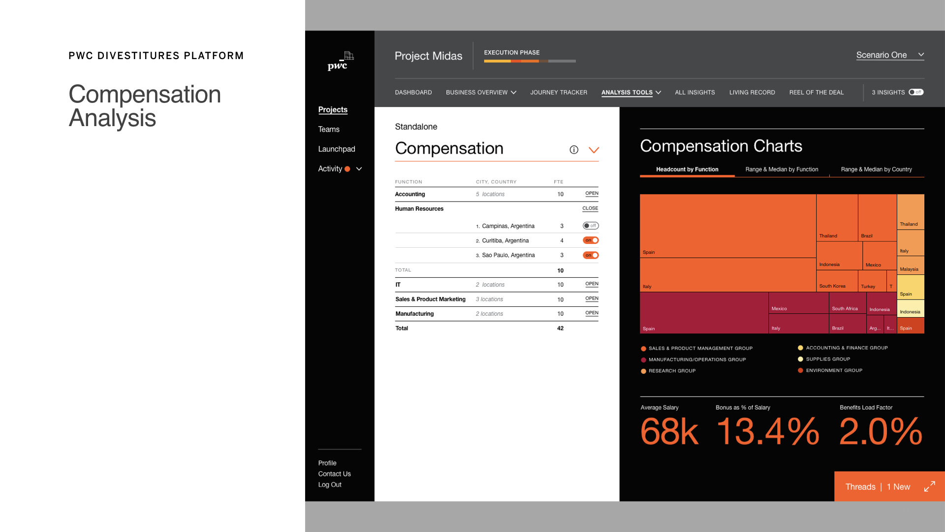
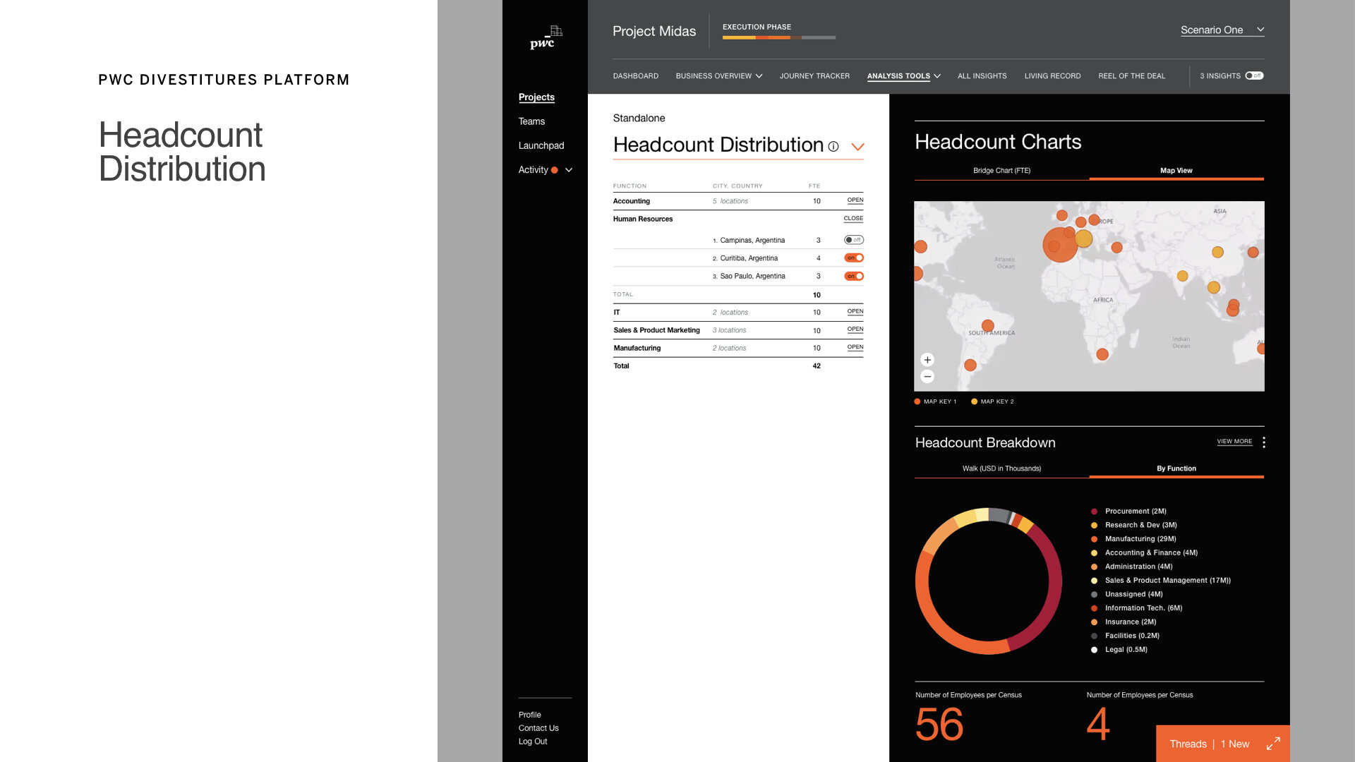
Visual analytics and dashboards
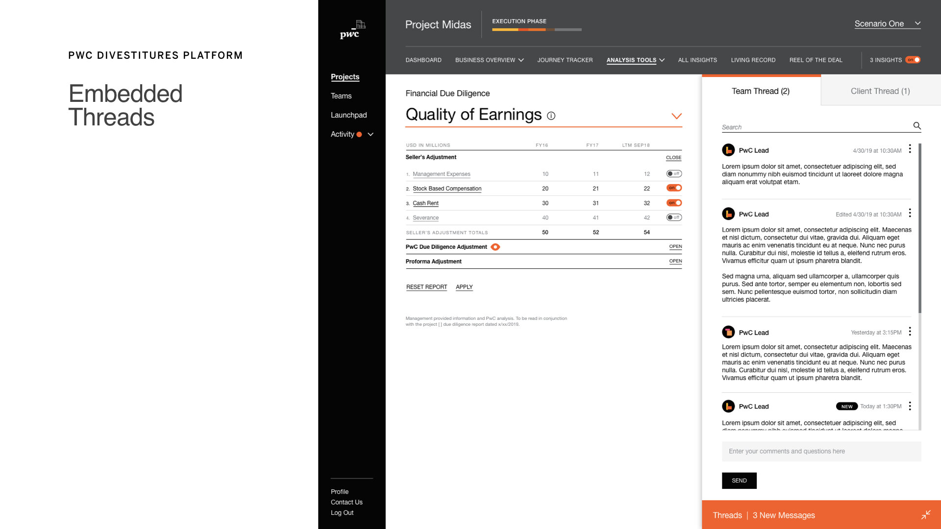
Collaboration, team assignments, and commenting threads
Standout Features
Feature Mapping Grid: Sprint planning and visual roadmap for 20 platform capabilities.

Process Work defining Sprints and Features to include
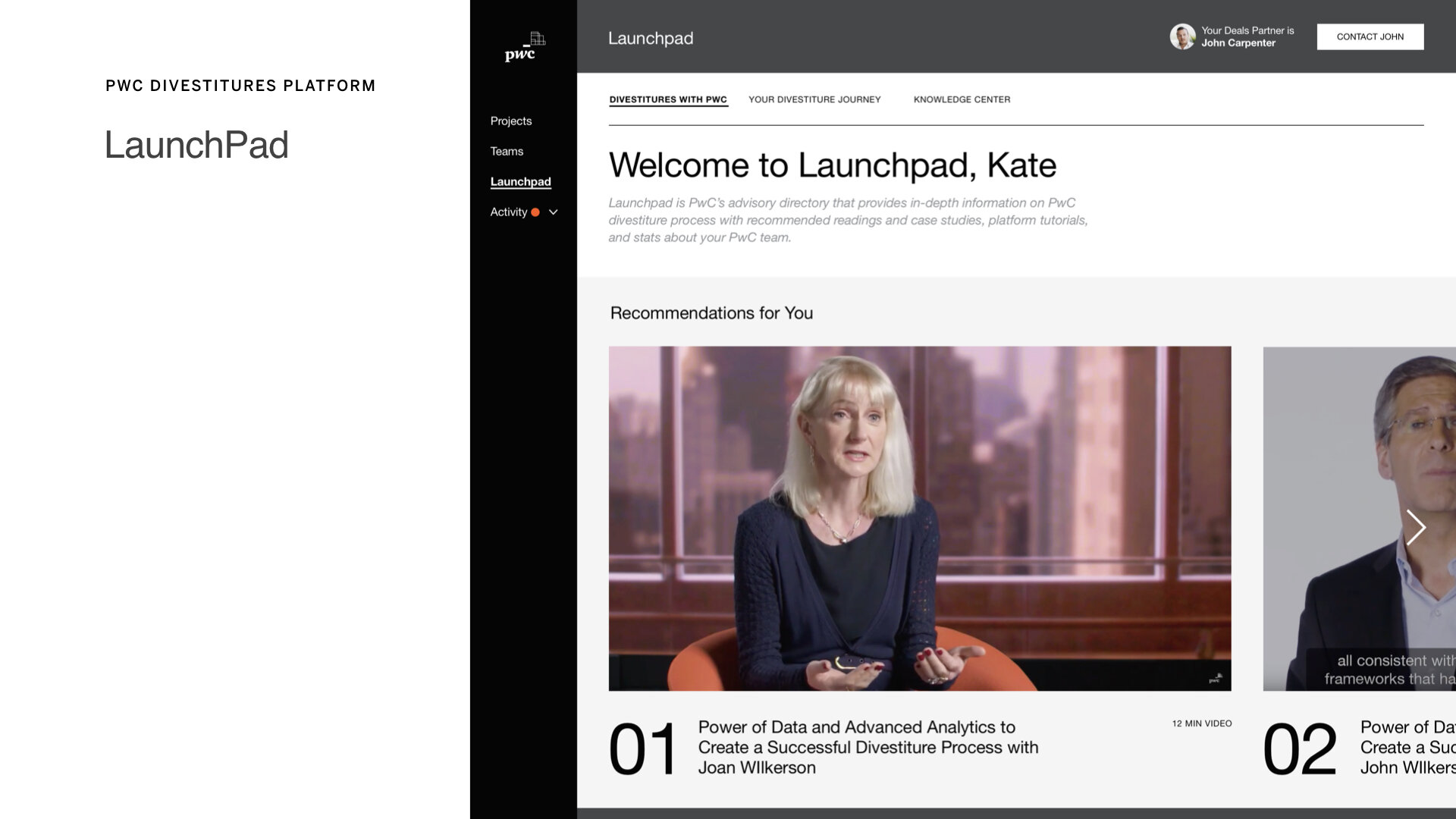
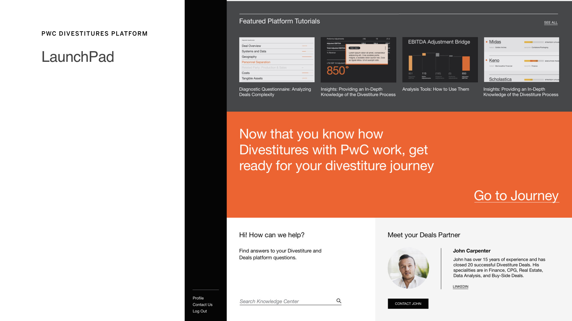
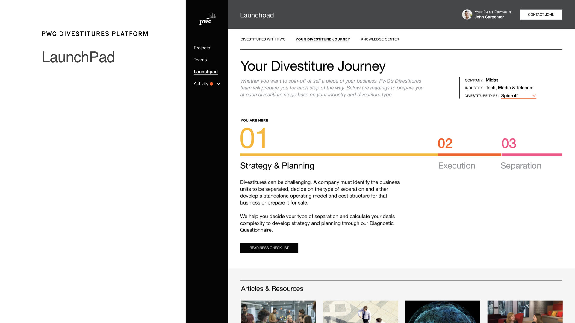
Onboarding Questionnaire UI: Guides clients through standardized intake of business unit data.

Data Visualization Modules: Allows consultants to isolate business lines and visualize value.
Collaborative Workspace UI: Features team tagging, internal commenting, and progress visibility.
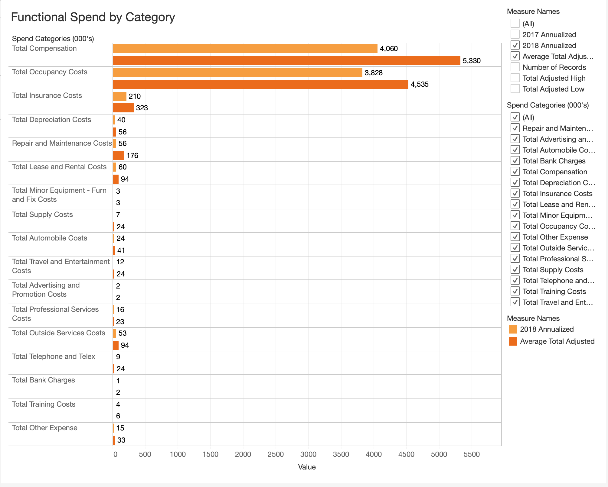
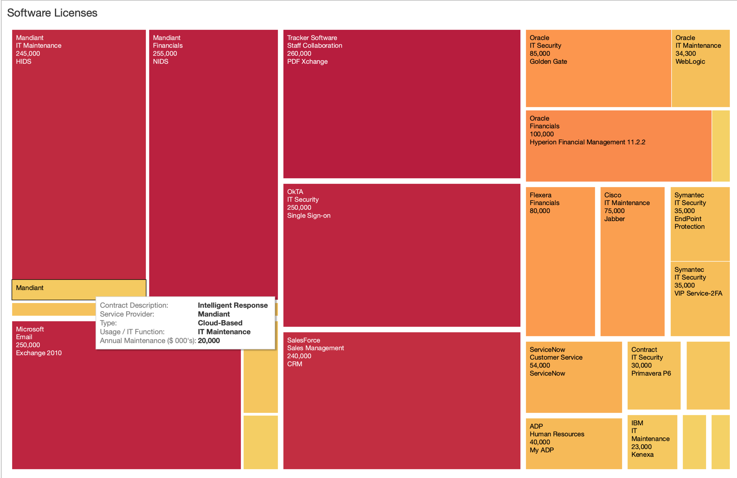
Change Enablement Extension (Tableau Work)
To support early adoption, I designed and developed dynamic Tableau dashboards that visualize sample company divestment data. These tools were used to:
Preview the strategic functionality of the upcoming platform
Educate internal teams and socialize new workflows
Create momentum for change management across PwC’s organization


Impact
Result → Outcome
Completed design of 20+ features in 8 weeks → Created flexible design system for future iterationsEnabled long-term scalability as new features and modules evolve.
Developed early Tableau dashboards for training and buy-in → Initiated change management and helped bridge future-state expectations with current practices.
Key Reflection
“This project reinforced the power of design systems in aligning large teams on complex deliverables. Next time, I’d integrate product analytics earlier to refine prioritization mid-sprint.”
Design POV
“Complex enterprise systems should never feel complex to the people using them. For PwC, I designed structured yet intuitive flows that helped consultants navigate big data with confidence and clarity.”